字体说明
Mundo Sans™
字体英文名称:AM182___.TTF
Mundo Sans™
品牌:Monotype
设计师:
Crossgrove,Carl
发行时间:2018
字库编码:
Unicode
分类:
无衬线体
字体属性:
字体介绍
Mundo Sans由Carl Crossgrove设计,是一种将持续很长一段时间的设计。在十多年的断断续续的开发过程中,Crossgrove致力于该项目,他能够把设计打磨到现在朴实无华的程度。<br><br>
1991年,当我开始设计Mendo的时候,我曾很欣赏过几种人文主义的无衬线字体。“我使用了这些设计——令人惊讶的是,Futura——作为我设计中比例、字重、连贯、间距、以及节奏的模型。”Crossgrove还认为手写标牌对Mundo Sans家族的Heavy字重产生了重大的影响。这些字母有时是“尺寸巨大的”,Crossgrove解释说,“使用粗重的无衬线大写字母,稍微向外张开的字干,以及一副人文主义的骨架。<br><br>
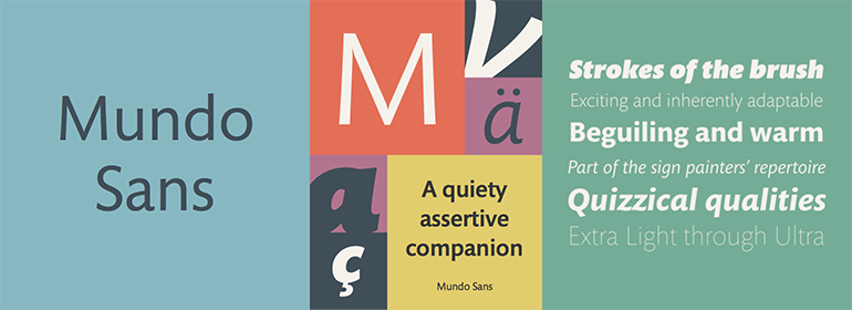
在整个项目中,Crossgrove的目标是创作一种人文主义字体,它具有许多不同的字重以及流畅的、不突出的斜体。他保持了设计的简洁以及独特,以供显示使用。具有七个字重和一组补充的手写斜体,这在Mundo Sans家族范围内几乎没有。字重范围从纤细且淡淡的Extra Light到Medium,再到活泼而粗壮的Ultra。<br><br>
Mundo斜体是真正的草写体设计,具有流畅的笔画以及明显的书法之意。‘a’下部的笔画,‘f’的下伸部笔画和’z’优美弯曲的基线为设计增添了优雅感,并将其与更传统的斜体罗马斜体区别开来。<br><br>
Crossgrove表示Mundo并不意味着革命性,但它有一个特点将其与其他的人文主义无衬线字体区别开来。不用喊“新的且与众不同的”,Mundo就可以了。”<br><br>
Mundo Sans, from Carl Crossgrove, is a design that’s going to be around for a good long while. In the more than ten years of on-and-off development Crossgrove devoted to the project, he was able to polish the design to its current unpretentious luster. This is a typeface with legs.<br><br>
There were several humanist sans typefaces that I admired when I began work on Mundo in 1991. I used these designs – and surprisingly, Futura – as models for proportion, weight, flow, spacing, and rhythm in my design." Crossgrove also gives credit to hand-lettered signage as a strong influence on the heavy weights in the Mundo Sans family. These letters were sometimes "giant-sized," explains Crossgrove, "using heavy sans caps with slightly flaring stems, and a humanist skeleton. This lettering style was part of the sign painters’ repertoire before signs were produced digitally."<br><br>
Throughout the project, Crossgrove aimed to create a humanistic typeface with subtle pen ductus, a wide range of weights and a fluid, unobtrusive italic. He kept the design clean and distinctive enough for display use while still being sufficiently understated and proportioned for text composition. With seven weights and a complementary suite of cursive italics, there is little outside the range of the Mundo Sans family. Weights range from the delicate and understated Extra Light through the forthright Medium to the lively and robust Ultra. Mundo italics are true cursive designs with fluid strokes and obvious calligraphic overtones. The flick of the down-stroke in the ‘a,’ the descending stroke of the ‘f’ and graceful curve of the baseline of the ‘z’ add grace to the design and distinguish it from more traditional sloped-roman italics.<br><br>
Crossgrove says that Mundo isn’t meant to be revolutionary, yet it has a quiet distinction that separates it from other humanistic sans. Without shouting "new and different," Mundo just works."
