字体说明
Mosquito™ Formal
字体英文名称:AM214___.TTF
Mosquito™ Formal
品牌:Monotype
设计师:
Berranger,Éric de
发行时间:2018
字库编码:
Unicode
分类:
无衬线体
字体属性:
字体介绍
Mosquito Formal由Éricde Berranger设计,采用的是活泼的Mosquito原创设计。强调的字符笔画,简单、直观的形状,相对较高的x高度,开放的字怀以及还有Peignot的影子,但是草书笔画和生动活泼的末端已被传统的设计所取代。结果就是更严肃、更复杂的字体。Éricde Berranger说,“这个想法是为了缓和Mosquito的吸引力。 使其‘平静’下里;在保留字符结构和整体外观的同时,消除其特质。” <br><br>
正如Eric de Berranger所言,尽管它仍然与众不同,但“Mosquito Formal阅读起来比看起来更容易,也更可视,因此比我之前的设计更可读。”然而,他确实在他的图形设计项目中使用了这两种字体:Mosquito适用于标题以及在需要活泼设计的应用,Mosquito Formal适用于那些需要更安静、更精致外观的实例。<br><br>
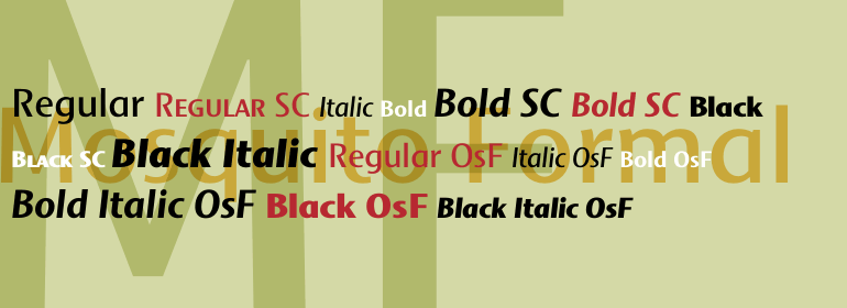
Mosquito有三种字重,包括补充的斜体设计和一套小型大写字母、老式数字以及替代字符。”<br><br>
Mosquito Formal, by Éric de Berranger, takes the original jaunty design of Mosquito and dresses it in a tuxedo. The stressed character strokes, simple, straightforward shapes, relatively large x-height, open counters and hint of Peignot are still there, but the cursive strokes and lively terminals have been replaced with traditional designs. The result is a more serious-and more sophisticated typeface. The idea," says Éric de Berranger, "was to assuage the drawing of Mosquito. To ‘calm’ it; and eliminate its idiosyncrasies while preserving character structure and general appearance."
<br><br>
Although still distinctive, as Éric de Berranger puts it, "Mosquito Formal is more to be read than seen, it is more invisible and thus, more readable than my earlier design." He does, however, use both typefaces in his graphic design projects: Mosquito for headlines and in applications where the lively design is appropriate, and Mosquito Formal for those instances that require a quieter more sophisticated look.
<br><br>
Mosquito Formal is available in three weights with complementary italic designs in addition to a suite of small caps and old style figures. "
