字体说明
Neue Helvetica® eText
字体英文名称:HelveticaNeueETPro-45Lt.TTF
Neue Helvetica® eText
品牌:Linotype(Monotype)
设计师:
Linotype Design Studio; Kobayashi,Akira
发行时间:2018
字库编码:
Unicode
分类:
无衬线体
字体属性:
字体介绍
In 1983, D. Stempel AG redesigned the famous Helvetica typeface for the digital age, creating Neue Helvetica for Linotype: a self-contained font family. Today, this family consists of 51 different font weights. _x000D_
_x000D_
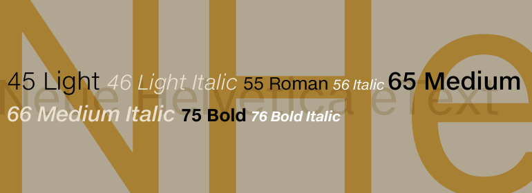
It’s original numbering system for the weight designations came from Adrian Frutiger’s numbering system for the Univers family. The basic font weight, Neue Helvetica Roman”, is at the heart of this numbering system. The designation “55 Roman” forms the central point. The first figure of the number describes the stroke thickness — 25 for ultra light to 95 for extra black. The second figure gives information on the width and orientation of the font — “Neue Helvetica 53 Extended” or “Neue Helvetica 57 Condensed,” for instance._x000D_
_x000D_
Neue Helvetica sets new standards in terms of its form and number of variants. It is the quintessential sans serif font, timeless and neutral, and can be used for all types of communication. Neue Helvetica is one of three Helvetica typeface families from Linotype._x000D_
eText fonts – the optimum of on-screen text quality_x000D_
With our new eText fonts that have been optimised for on-screen use, you can ensure that your texts remain readily legible when displayed on smartphones, tablets or e-readers. _x000D_
The poor resolution of many digital display systems represents a major challenge when it comes to presenting text. It is necessary to make considerable compromises, particularly in the case of text in smaller point sizes, in order to adapt characters designed in detail using vector graphics to the relatively crude pixel grid. So-called ‘font hinting’ can help with this process. This, for example, provides the system with information on which lines are to be displayed in a particular thickness, i.e. using a specific number of pixels. _x000D_
As font hinting is a largely manual and thus very complex technique, many typefaces come with only the most necessary information. What is unimportant for a text printed in high resolution can result in a poor quality image when the same text is displayed on a screen, so that reading it rapidly becomes a demanding activity. _x000D_
Specially optimised eText fonts can help overcome this problem. An extremely refined and elaborate font hinting system makes sure that these fonts are optimally displayed on screens. Monotype has not only adopted font hinting for this purpose but has also thoroughly reworked the fonts to hone them for display in low resolution environments. For example, the open counters present in the letters C, c, e, S, s, g etc. have been slightly expanded so that these retain their character even in small point sizes. Also with a view to enhancing appearance in smaller point sizes, line thickness has been discreetly increased and x-height carefully adjusted. Kerning has also been modified. _x000D_
Don’t leave the on-screen appearance of your creations to chance. Play it safe and use eText fonts to achieve perfect results on modern display devices. Many typefaces, including many popular classics, are already available as eText fonts and new ones are continually being published. _x000D_
The eText font you can purchase here are available for use as Desktop Fonts or Web Fonts. Should they be used in Mobile Devices such as smartphones, tablets or eReaders, please contact our OEM specialists at sales-eu@monotype.com. “
