字体说明
Linotype Ergo™
字体英文名称:ErgoCom-Regular.TTF
Linotype Ergo™
品牌:Linotype(Monotype)
设计师:
Munch,Gary
发行时间:2018
字库编码:
Unicode
分类:
无衬线体
字体属性:
字体介绍
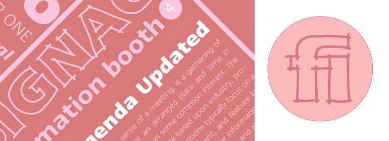
Linotype Ergo由美国人Gary Munch设计,是1997年Linotype第二届国际数字设计大赛的获胜者。它融合了传统和现代的字体概念,既可以作为一个清晰可读的文本字体,又可以作为一个生动的显示或标题字体。ergo这个词的意思是“因此”,但它也来自希腊语“ergon”,意思是“工作”。因此,Munch认为这个家族充满了活力——这是努力工作,表达观点的理想字体,并且能够以友好的活力将其传达出去。<br><br>
字符的笔触经过精心设计,以适应眼睛扩大水平方向和将垂直方向感知为更轻的趋势。小写形式有开放的、友好的字怀,并通过小的特点得到增强,比如略微倾斜的s和宽t。<br><br>
Ergo有四个正常宽度的字重,五个condensed的字重和两个compressed的字重——他们都有相应的斜体! 该家族还包括一个用于标题的巧妙的“Sketch”字体,使字体样式总数达到23种。<br><br>
Ergo有希腊文和西里尔文两种字体,W2G有希伯来文字体。”<br><br>
Linotype Ergo was designed by American Gary Munch, and was a winner in Linotype’s Second International Digital Design Contest in 1997. Conceived as a blend of traditional and modern type concepts, it works as a legible text family as well as a lively display or headline font. The word ergo means consequently," but it also comes from the Greek word "ergon" for "work." Consequently, Munch sees this family as full of energy — an ideal font for working hard to make a point, and able to get it across with friendly vigor. <br><br>
The strokes of the characters are carefully designed to accommodate the tendency of the eye to enlarge horizontals and perceive verticals as lighter. The lowercase forms have open, friendly counters and are enhanced by small quirks, such as the slightly leaning s and the wide t. The deep branching of curves from main strokes helps this humanist sans to be very readable at smaller sizes.
<br><br>
Linotype Ergo has four normal-width weights, five condensed weights, and two compressed weights – all with companion Italics! The family also includes a clever "Sketch" font for use in headlines, bringing the total number of font styles to 23.
<br><br>
Ergo is available with Greek and Cyrillic and as W2G fonts with Hebrew."
