字体说明
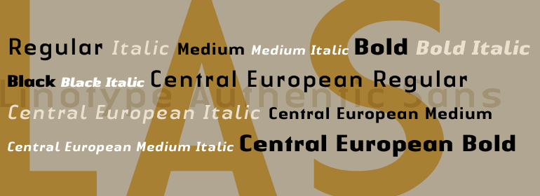
Linotype Authentic™ Sans
字体英文名称:AuthenticSansCom-Regular.TTF
Linotype Authentic™ Sans
品牌:Linotype(Monotype)
设计师:
Huschka,Karin
发行时间:2018
字库编码:
Unicode
分类:
无衬线体
字体属性:
字体介绍
Linotype Authentic是由德国设计师Karin Huschka于1999年开发的后现代字体系统。它有30种个人风格,Linotype Authentic分为四个子家族:Linotype Authentic Serif(8种风格),Linotype Authentic Stencil(6种风格),Linotype Authentic Sans(8种风格)以及Linotype Authentic Small Serif(8种风格)。<br>
Linotype Authentic系统的后现代性通过其风格特征(搭扣式衬线,小衬线和模版“白色空间”线条)以及其字形的整体风格来体现。字母似乎是由一个复杂的矩阵系统所构成。通常是完全弯曲的元素被展平了。大写字母变窄了。“Serif”和“Small Serif”都是粗衬线的变体。“Small Serif”让人联想到在Didone字母上发现的那种衬线(即Didot或Bodini)。 <br>
Linotype Authentic字体可用于各种各样的磅值,从小文本(中等大小)到标题、标题、显示、书籍封面和海报。如果用好了,Linotype Authentic也能设置出一个出色的logo。”<br><br>
Linotype Authentic is a post-modern type system developed by the German designer Karin Huschka in 1999. With 30 individual styles, Linotype Authentic is broken up across four sub-families: Linotype Authentic Serif (8 styles), Linotype Authentic Stencil (6 styles), Linotype Authentic Sans (8 styles), and Linotype Authentic Small Serif (8 styles).<br>
The post-modern-ness of the Linotype Authentic system manifests itself through its stylistic qualities (snap-on" serifs, small serifs, and stencil "white space" lines) as well as through the overall appearance of its letterforms. The letters seem to be built from a complex matrix system. Elements that would normally be full curved have been flattened out. The uppercase letters run condensed. Both the "serifs" and "small serifs" are of the slab serif variety. The "small serifs" are reminiscent of the sort of serifs found on Didone letters (i.e., Didot or Bodini).
<br>
The Linotype Authentic fonts may be used in a wide array of point sizes, from small text (in moderate amounts) to headlines, titling, displays, book covers and posters. Linotype Authentic can set a mean logo in the right hands, too."
