字体说明
Diverda™ Serif
字体英文名称:DiverdaSerifPro-Regular.TTF
Diverda™ Serif
品牌:Linotype(Monotype)
设计师:
Lanz,Daniel
发行时间:2018
字库编码:
Unicode
分类:
字体属性:
字体介绍
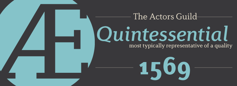
Diverda Serif is a contemporary typeface that is free from ornament. Created by Swiss designer Daniel Lanz, Diverda Serif is optimized for maximum legibility. In contrast to many other modern typefaces, which try to squeeze the traditional rounder forms of the alphabet into square designs, and which often attempt to equalize the widths of the capital letters, Diverda Serif remains true to the proper proportions of the Roman alphabet. The x-heights of Diverda Serif’s characters are low, and the differences between curved, square, and triangular elements are very clear. Like the more calligraphic typefaces of the past, Diverda Serif’s strokes exhibit contrast that is inspired by movements of the pen on paper; down strokes are heavier than up strokes. Possible applications for the Diverda Serif include magazine design, as well as advertising for fashion, design, or architectural products. Diverda Serif is also a good fit for Corporate Identity solutions.
Diverda Serif has a matching sans serif companion family, Diverda Sans.
The ten fonts in the Diverda Serif family are all Linotype Com” OpenType fonts; their character set includes glyphs necessary for the setting of 48 Latin-based languages. These include all of the languages in Western, Central, and Eastern Europe that use the Roman alphabet (including the Baltics and Turkey). Also, the upright fonts in the Diverda Serif family include extra ligatures, small caps, small cap figures, and oldstyle figures. The Italic fonts include extra ligatures and oldstyle figures.”
