字体说明
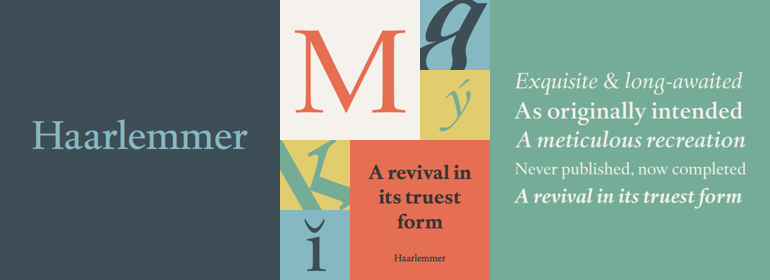
Haarlemmer™
字体英文名称:HAAR____.TTF
Haarlemmer™
品牌:Monotype
设计师:
Krimpen,Jan van; Blokland,Frank E.
发行时间:2018
字库编码:
Unicode
分类:
衬线体
字体属性:
字体介绍
Haarlemmer是对从未被生产过的Jan Van Krimpen字体的再创作:这展示了他最初是如何设计它的。<br>
最初的版本绘制于20世纪30年代末,是为Dutch Society for The Art of Printing and Books创作的,而且会通过使用Monotype排版将其用于新版《圣经》的设置。因此,问题就出现了:像Linotype和Monotype这样的铸字排版的字体必须在一个预先确定的字符宽度值中创建。每一个字母都必须与之相匹配,且其间距由一个只有18个单元的网格决定。通常,斜体字符的宽度必须与罗马设计的宽度相同。Van Krimpen认为这严重损害了设计过程。<br>
第二次世界大战期间,荷兰的入侵中断了Bible项目的所有工作,最初的Haarlemmer从未投入生产。快进60年。<br>
Dutch Type Library的Frank E. Blokland想要复刻最初的哈Haarlemmer,但这次是Van Krimpen所希望的。 Blokland重新诠释了原始手稿,并创作了一款与Van Krimpen的最初概念尽可能匹配的字体。虽然Van Krimpen再也无法掌舵了,但对他作品进行的深入研究弥补了他的缺席。<br>
其结果就是一个出色的包括三种字重的文本家族,有互补的斜体设计和一整套小型大写字母以及老式数字。Van Krimpen将为此感到自豪。<br><br>
Haarlemmer is a recreation of a never-produced Jan Van Krimpen typeface that goes one step beyond authentic: it shows how he wanted it to be designed in the first place. <br>
The original, drawn in the late 1930s, was created for the Dutch Society for the Art of Printing and Books and was to be used to set a new edition of the Bible, using Monotype typesetting. Hence the problem: fonts for metal typesetting machines like the Linotype and Monotype had to be created within a crude system of predetermined character width values. Every letter had to fit within and have its spacing determined by a grid of only 18 units. Often, the italic characters had to share the same widths as those in the roman design. Van Krimpen believed this severely impaired the design process.
<br>
The invasion of Holland in World War II halted all work on the Bible project, and the original Haarlemmer never went into production. Flash forward about sixty years.
<br>
Frank E. Blokland, of The Dutch Type Library, wanted to revive the original Haarlemmer, but this time as Van Krimpen would have intended. Blokland reinterpreted the original drawings and created a typeface that matched, as much as possible, Van Krimpen’s initial concept. While Van Krimpen’s hand could no longer be on the tiller, a thorough study of his work made up for his absence.
<br>
The result is an exceptional text family of three weights, with complementary italic designs and a full suite of small caps and old style figures. Van Krimpen would be proud.<br>
